DoorDash Collections
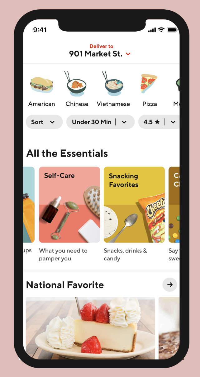
With the DoorDash build at the time, the only way to find something to eat was to select a food type at the top, use filters, and hope for the best. So, we launched Collections.
Collections helps users see more of what DoorDash to offer with engaging, relevant, and creative content—instead of just restaurants by type.
Our PMM Connie Kim facilitated all points between product and creative. My art director Eva Edgren brought all of the color palettes, iconography, and images to life. And I wrote all the copy.
This page is optimized for mobile.
The “Only in San Francisco” Collection
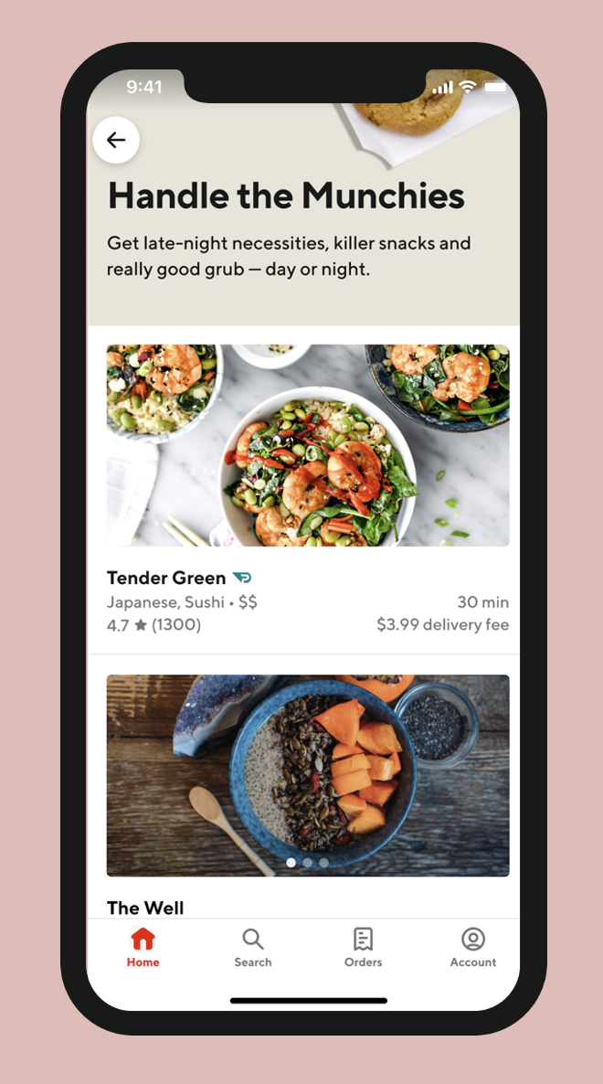
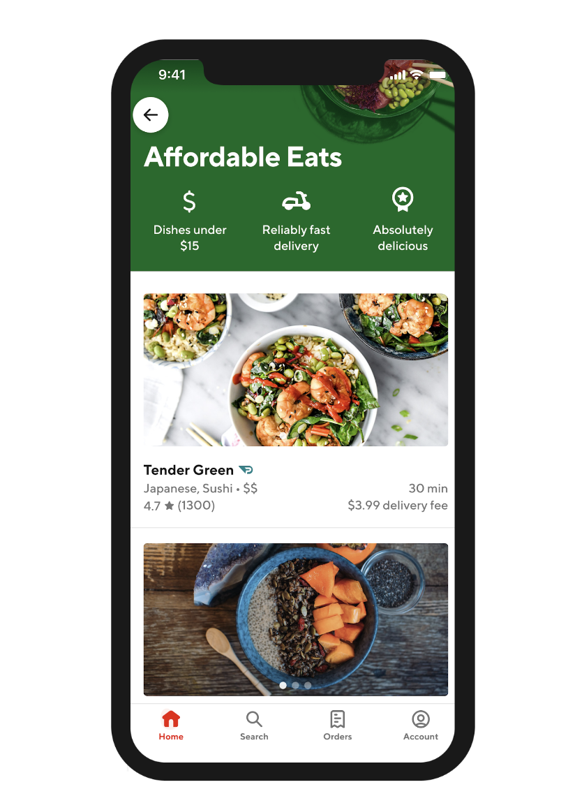
Every tile in a Collection opens its own landing page

Tile landing page picks up where the user left off ![]()
Collections grows user engagement by presenting more choices in more engaging ways. For time-sensitive initiatives (e.g. The Eras tour in San Jose), a Collection of tiles can be quickly built from a library of existing assets, with the Collection Name and Tile copy built around the event.
For example, if Halloween is fast approaching, a Devilish Delights Collection could be quickly pulled together featuring: a candy tile for the retail store vertical, a pizza restaurants tile, a drinks tile for the alcohol vertical, a home decor tile (Bed Bath Beyond Partnership) and a pet costumes tile (from Petco). We made collections for to celebrate the weekend, the summer, and even The Big Game.
Example tiles

Example landing page

Collections give users more options while showcasing the endless choices DoorDash has to offer.


